

[picture shows a beautifully designed kitchen based on the SEKTION box, featuring shallow SEKTION boxes stacked on the countertop for a layerd, nuanced, sophisticated look]
Chapter 1 - Stacking SEKTION boxes
Everyone knows that the SETKION box is incredible flexible, coming in with all sorts of sizes and super cool options that you would have to pay a meellion dollars for anywhere else [just for comparison: an IKEA 'Lazy Suzzanne' is ~200 bucks vs. $750 dollars for an equivalent option from other hardware manufacturers!].
But I have never been able to find clear directions and answers to properly stacking the shallow SEKTION box on a countertop - example above. Today, again, on Reddit, r/IKEA, someone posts this question:
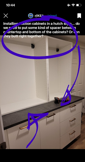
They have created a design [likely set on the IKEA plastic legs, meaning this design will draw heavily on ALL the other 'look-alike Ikea kitchens' --> FIRST step in achieving a 'Custom Lewk' [tm] is taking your design OUT of the 'Ikea kitchen planner language'] and are wondering how to go about installing the shallow SEKTION boxes.
The shallow SEKTION boxes [because there are 2 depths to SEKTION boxes - DEEP and SHALLOW; both have their uses, benefits and advantages, as well as 'hackability level'] are set upon the countertop, above the deep SEKTION boxes to create a 'Hutch Look'.
The 'Hutch Look' is essentially creating a 2 level design:
- Bottom one is deeper, roomier, with more storage. Typically with drawers; heavy stuff goes here; less pretty stuff goes here; ugly stuff that you want to hide goes here.
- Top is lighter, slender, shallower and typically the function is split between storage and display. This is where you would showcase you 'conspicuous consumption' in the form of fine and exotic china, precious collectibles and anything else that is meaningful to you - TRADITIONS are important.
----> Designer Trick: to increase the perception of height in your space don't take your 'hutch design' all the way to the ceiling. If your space is SHORT - lacks height - leave a minor space between your cabinets and the ceiling as illustrated on my own hutch design. Oh, and skip the tall crown moulding opting instead for something simple, classic and well proportioned. This post talks about this particular design and gives you simple instructions on how to make your space look bigger - HERE is the write UP!
----> Designer Trick: To 'CROWN-mould' or 'not-to-CROWN-mould'..? My experience, my intuition, always tells me that hutches were 'work-furniture' first and thus I stay away from any 'too precious, too decorative, too pretentious' crown mouldings and ALWAYS choose the simplest, classic option that fits and matches the build. Remember, that the crown moulding is an integral part of much larger 'first impression' and should not 'steal the show'; simpler is better for hutches.
Chapter 2 - 'Eloquent and historic'
Below is an example of a very fine North American production hutch, ~1950's - just the bottom; will update overall shot - made in cherry. Yes, this is natural cherry when it ages as it should - on display. It is absolutely wild to me to think that my family bought this piece used, when we immigrated to Canada in 1991 for an equivalent of about '1.5 rents on a 3 bedroom unit'. Today I would not undertake this production for less than $30k - it is so beautifully and thoughtfully made; well detailed in elements that suggest great fluency in craft; the grain matches so well and clearly sourced from a single log; the quality of the wood is amazing in itself; the finish is holding up amazing; hardware if decorative and well made; load bearing! - holy cow!; it's just a really good quality piece.

We won't be getting into the design aspect of hutches - balance, proportions, functionality, ----> this post focuses how to construct the look using SEKTION boxes. I will give you 'my hutch' example. Here, it's an IKEA Hack too! - I highlighted all the elements that were sourced from IKEA - that's right, this is Swedish Socialism!

Here is the the list, all sourced from IKEA Etobicoke - the bestest of all location -
- 'A' is a pane of glass from a broken BILLY bookcase door that I picked up at AS-IS section for 10 bucks - good quality, nice thickness, excellent clarity, tempered for safety [meaning the glass will break up into 1000's little harmless pieces instead of producing jagged shards; ALL glass in any millwork projects MUST be safety glass, so either tempered OR laminated; A MUST!!]
- 'B' is a KARLBY birch slab that I picked up for $20 bucks because it was damaged in transit. Discount reflects the severity of damage to the piece - it was 'almost un-sale'able' - however for this particular design I was able to cut around it and salvage a really nice chunk of it.
----> One of the most 'annoying things' with cabinetry and millwork in general is when the edging fails - the finish material that is applied to cover the exposed and vulnerable edges. The cheaper the build, the less thoughtful the design, the crappier quality the edging - it's the first to fail as is most exposed to typical 'bumps and bruises of kitchen life'. To avoid frustration and give it a solid, trouble free performance I applied a 1/4" thick Canadian hard maple edge. Right away I will confess that this decision was right - it's extra labour + materials... but - it has saved this piece many times over! With 4 babies at home they all keep hitting and banging into that edge with various hard objects! The finish on the wood is BULLET-proof. For all my 'wood+water' situations I use a product called OSMO - it is a modern synthetic hardwax that cures hard for 30 days with my especially developed finishing process! - bulletproof; I even do exotic wood sculpted tub edges in this finish - damp and wet ALL the time!

- 'C' are ENERYDAS, here ---->

This Ikea Hack Hutch design got an update recently - SO has been bugging me to fill up that empty space above the coffee maker. After pricing some nice looking hardware that came up to like 400 bucks [!!!], I opted instead to go with IKEA again, saving myself around 250 bucks. Here!

Let's bring this picture here again. I think that this is such a beautiful and balanced kitchen design. The SEKTION boxes fit perfectly. But the most important observation that I want to make is this: it has certain 'eloquence and historicism'.
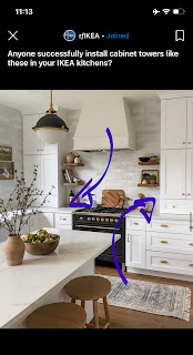
In my writings and designs I often talk about Psychology of Design - one of my obsessive interests is 'human behaviour in residential settings' [I created a term for it, I call it NHA - 'Necessary Human Activity' and I always try to optimize it; boring!!]. Our interiors have dramatically evolved over the last say 500 years, but our 'kitchen human behaviours' essentially stayed the same. Historically, cabinetry existed first as furniture. When a move was made to make that furniture more permanent - built-ins, kitchens - 'the dimensions of that move stayed the same', meaning the physical structure was bulked up for heavier loads, but objects created still matched the 'limits of human body': we can only reach so far and high; it's only comfortable to perform certain tasks [Necessary Human Activity] in certain 'body positions and angles'. And let me tell you that the HUTCH is perfect for it! - it's an 'organic, natural resolution' to our human needs.
Now take a look at 'functional design history' and you will see countless examples of hutches ranging from the most utilitarian, basic work-kitchen hutches to exquisite, precious builds found in manors, made for 'displaying history and family's good taste.' You see hutches everywhere, every household has one, because they work, and they work well. The HUTCH is the workhorse of any family assembly! We all have seen them; we all have experienced them throughout our lives and likely have 'unconscious friendly hutch bias'. TRUE!
All we are trying to do is to replicate, re-experience, re-live all those 'good times'! I think. Look, my own design, the one you see above, the IKEA Hack, I 'psychologically traced' [function, balance, proportions, display etc.] to a kitchen hutch that my Polish grandmother had in her ancient rental kitchen in New York city, during her immigrant years. The house she lived in - 30 years! - was built in the early 20th century featured all solid wood kitchen which had 'normal then, but exquisite by today's standard' joinery. So the quality was there right from the start, I could tell that as a curious child. Bring into that 'The Charm Factor' - wonderful smells of cooking and baking during Christmas, Thanksgiving and Easter [smell is POWERFUL emotional trigger!]; tiny spice drawers; tall glass doors displaying various glassware and china.
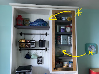
Those two pieces I highlighted in my own hutch I inherited from my grandma Helena ---> that ceramic blue fish is an exquisite Japanese serving bowl for fish soup from 1890; that ceramic kettle is British made from late 1800's as well. I treasure these piece immensely because I have wonderful childhood memories associated with them... My hutch is my family's history in some way... you know.
~~And that my friends is the secret to designing successful 'Hutch Designs' - call onto all your childhood memories... That's all!~~
Chapter 3 - Ok then, how do I stack the SEKTION boxes to make them look like a 'Hutch Design'...?
I am gonna say that IKEA will be an asshole** and for warranty purposes will claim that they need to be hung up - a classic SHALLOW SEKTION install - it's the best; the flexibility of that hanging system is incredible and needs a creative individual to truly open up the potential of it.
Bummer is that for this to be done well, it needs to be done very very accurately. How accurately..? This accurately, LOOK ---->
Exciting NEWS ---> I stumbled upon a professional who is MY equivalent but when it comes to organizing 'little stuff'! [I organize BIG stuff - kitchens, closets... etc. vs. LITTLE things, so everything else, like your clothes, electronics, etc. and things you don't even knew about. But let her take care of that. Her mind just works differently than other people! I follow her advice [after 10 years, I achieved Inbox ZERO, for example]. Her name is Melissa, and she is a fellow volunteer Scouter with Scouts Canada. When I met her she was responsible for managing [volunteer!!] the youngest category of kids in the organization - you know how adults talk that managing young children is taxing? try being efficient at it!
Anyhow, BACK to SHALLOW SEKTION installs - I use that paper for a particular reason - it's another IKEA hack, lol - it's the top flap of the SEKTION hardware box and it's found in every SEKTION box. If I was to guess how thick it is, I would say about 1.2mm...? I know what 2mm gaps on cabinetry look like [sharpest look!] and this is skinnier, but I also know that it's more than 1mm... But exactly...? who cares, why measure..? Using spacers such as these on site is an improvement in accuracy that is easily available! The other secret about that little cardboard tab is that is ~very dense~ - meaning it will not crush or collapse and keep that gap consistent as a spacer. Advantage you!
TO BE CONTINUED...
**oh, it's ok... Don't cry for IKEA... don't shed those single tears. I feel at ease calling them assholes - WHY? - the next calendar year after my show and launch of my WILLIAM bookcase line, IKEA renamed their BILLY bookcases, you guessed... WILLIAM.
~~'When you hack an IKEA BILLY bookcase and you elevate it in the process, it becomes a WILLIAM bookcase' - Karol Kosnik,
Studio Kosnik.~~
See, Designing, as creative process is very wholesome and embracing. A good designers applies the entirety of their 'skills repertoire' to the project and considers everything, including 'naming strategies' and marketing.
~~ 'I design for the unreasonable.' - Karol Kosnik,
Studio Kosnik ~~
ps. Here is another TRICK!