Tuesday, August 23, 2022

Death, Taxes and BODBYN - Exit Review


picture shows a discontinued green BODBYN doors, along side a gray LIDI drawer front [also gone]


  • IKEA discontinues their most powerful SEKTION door.
  • It is becoming hard to predict which SEKTION door will get cancelled next; the 2022 Kitchen Catalogue is already incorrect and makes things hard to plan
  • Swedish Socialism is the only Design Philosophy that overcomes the unpredictability of planning a SEKTION event;


Wednesday, July 27, 2022

Where will you buy your furniture - Swedish Socialism 2 OR IKEA discontinues White Oak BILLY bookcase

[prelude]

[picture shows a screen capture from IKEA's official website, informing us of the planned changes to the fabrication methods]

Chapter 1 - IKEA discontinues White Oak BILLY bookcase.

As inflation starts biting more and more it will become more important to understand if you are getting good value for your hard earned money.

It will be necessarry to skip the glossy advertising and reach to the source - r/SwedishSocialism [get the Reddit app!] - for reputable, consistent and relevant information on meta-IKEA products, their improvements and essentially 'things that make sense for life'.

Money can be made on 'chachkas, dudas and flim-flam' OR it can be made on products manufactured with longevity and comfort in mind. 'Yes! IKEA makes that kind of furniture - white oak BILLY bookcase was that kind of piece of furniture.

Part of Caring for Environment means reducing your footprint on the planet and r/SwedishSocialism solves that. You get dependable, community centred and shared information and ideas, that ARE helping - first and foremost ~you~; remember, you have to be successful first before you can help others to be successful.

Furniture destined for the Western Market is rarely made in the Western Market, that's not simply how our economy works. I personally experienced the birth of globalization - I'm stuck in the 90's; that's 'my decade' - and it was always sold to me as delivering democracy via economic means. Various metrics point to the success of that era - untold numbers of individuals were 'lifted out of poverty'. 

If you were a giant behemoth - like IKEA; it's mainly the purchasing power - but also you were forward thinking because you lacked the traditional 'institutional inertia' of other companies, meant that you could experiment with new ways of reducing your labour requirements to produce what I consider 'a very useful and practical human designs.' 

IKEA created a new vision for furniture. When a table design that included 'an elegant end-vise' won an award from IKEA for 'forward thinking functionality' - not yet defined! - it gives you a glimpse, a preview of what humanity is about. 

Humanity is about creativity and improvement. I'm on REDDIT - it's considered 'social media' but I don't view it quite like that - and read a common observation that 'carpenter's job does not scale up' like, for example, tech worker's jobs scale up. This is the reason cited for a lower pay range of 'carpenters vs. tech workers'. That gave me quite a pause, and I thought about that statement extensively. I replied too. 


The value of tech-worker and carpenter is identical and if properly grown and 'harvested for ideas' both are excellent life style choices. Greatest value in trade work, in my opinion, lies in the fact that a 'trade's person' has a skillset that allows them to easily manipulate their surroundings. When you pair that up with human-centred design on the most granular level - individual; iDesign - you solve the greatest challenge posed to Interior Design in Human History - yours. 

See?! 

See?!

Solving for that solution and finding it successfully has immeasurable positive outcomes. You start living - I am serious. Simple, small elevations that move 'away from the standard' and into your own 'personal comfort zone' [I call that luxury] is all that is required for an 'elevated life'.  


Chapter 2 - The Cheapening and its victims


I learned of the plan to discontinue the white oak Billy bookcase on the subreddit r/IKEA.

[edit: Reddit is very fussy about linking; if you right click and copy the link it will let you open a new window; good read, I promise]

It was actually posted by Jules from Ikea Hackers with the tone and the message of 're-birth of BILLY'. I carefully read the press release and dug deeper into the links to better understand what is happening and why it is happening. 

So what is exactly happening? 

IKEA is getting rid of a specific step in case goods production of BILLY - the edgeing step. 'Edgeing' is a general woodworking practice of applyig a protective layer on the most vulnerable of parts of any box - the edges. The cover for the edges typically matches the finish of the surface - so white panel ends up edged with white edging; white oak surface is covered with thin layer of white oak solid or wooden veneer tape. 

I consider edging to be the most important part of any case goods - its strength - because it protects the part that is most exposed to damage thru daily living. 

source: private personal interior designer to 4 babies + dog; 19+ years and counting

I am not the only one that thinks this. Look - 


[picture shows a large white oak panel in a professional finishing booth, glossy from being freshly sprayed with latest super matte acrylic finish, with an arrow pointing to the solid wood edging at the bottom of the panel]


My hobby bossman [we build for the 1%] always edges all his panels this way - adds cost, but renders the panel esssentially timeless. And to be honest, I like the term 'timeless', because I believe that we sincerely lack that quality in our life and we dearly desire it as it gives meaning to our existence by extending it; extending it either for us personally or for others.

Or I could say that I am simply appealing to the most powerful of human emotions - greed. Our relationship to our money is very intimate and personal. It represents our past and our success and we want to exhange it in best possible way - by obtaining a quality proportionate to our past efforts [this is only true, however, for the largest of IKEA's consumers; there exist other classes and other motivators].

Edgeing is quality and IKEA is getting rid of it. 


Chapter 3 - Emotions are fluffy tho..

They are and they are not - but here is something that caught my attention. This is from IKEA's official literature.


This section in particular caught my eye, look -->


'Lifespan and emotional connection are no longer design principles, rather will be defined during the circular business opportunity and circular loops work.' - I gasped. I gasped because IKEA artificially stripped themselves of the two most powerful qualitites of their products that were effortless to them - it cost them absolutely nothing, if we were to define in it terms of Rules of Capitalism.

Longevity and Emotional Attachment are one of the most important considerations under Swedish Socialism because they represent tremendous value and opportunity that is uncaptured by anyone else - this is where the Psychology of Design comes in. 


Chapter 4 - Sift the Drivel from Value


White Oak BILLY bookcase was my choice of case goods for my current and future library - proven durability furnished with items on display that bring meaning to my life aka. Emotional Attachment. I was so upset that I even posted Reddit IKEA community. You can read there my 'immediate designer outrage' - I'm over it now. When time will come to build the future library I will simply custom build it out of white oak sheet veneer goods - basically the same way that white oak  BILLY was designed and build. 

Where will you buy your furniture now, eh?


Tuesday, June 7, 2022

White oak YELLOWS - Ikea's VEDHAMN door review + HOW 2 handle that;

 [prelude] 

[picture shows a screenshot of VEDHAMN door listing on the Canadian IKEA app]


VEDHAMN is IKEA's new door for their SEKTION boxes - a solid white oak frame with a veneered plywood panel trapped in the centre. It is a plain frame featuring a small round as the solid transitions from the frame to the inside panel. It is sprayed with a clear acrylic finish - a lot clearer than the 'traditional cellulose look' of white oak. The selection of the solid appears good with minimal grain run out; the centre panel veneers feature nice long open grain. 

This is what you want in your door, really - if it is the AI robotic arm and eye that selects the veneers and assembles the doors it is doing a great job. Look - 


Chapter 1 - I love White Oak

White oak is one of the nicest hardwoods that we have growing here in North America. It is used to the climate, it always grew here and thus is well suited for any purpose that requires hardness, durability and good looks. 

White oak is also one of the hottest designer woods right now, and due to the inflation and demand it is commanding astronomical prices with decreased selection. It is not uncommon to purchase entire lifts of quartered white oak solid not just to secure a good price but also to secure the quality that you want - every board is looked over and its placement carefully considered within the larger scope. 

Historically this has not been the case at all. White oak was always looked down as the secondary cousin to red oak. If you did not have money for nice red oak hardwood floors, you could always compromise and get white oak instead. Savigs were around $1 a sq.f in material costs back in my flooring days; and if the flooring was stained than it was even harder to tell and the savings were good. 

Today red oak has fallen so much out of favour that beautiful red oak veneers - one of the nicests sequenital flitch layups I have seen in my life! - are used as backers on 'more precious layups'. Look - 

[picture shows beautiful and precious 'tiger stripe' figure red oak veneers used for backers on more in demand white oak veneers;]

Eventually even IKEA could not resist to jump on the white oak bandwagon - remember, it's always about the sales; 'people's wants, needs and desires' I wrote once, to describe IKEA's business model. Yes, design is cyclical and tastes need to be made [media / magazines] but white oak could not be pulled off successfully with thermofoil, I think, because white oak is quite culturally too familiar to us, and by 'us' I mean the Western Sphere of influence. White oak doors had to be solid. 


Enamoured? I've always been, and have some white oak doors currently in my personal life. They are aging gracefully and feature the 'traditional cellulose look' - never underestimate the power of visual association! They are yellowing nicely but because of the purposeful, 'white oak centered design', that shift is completely out of focus and not a visual priority. What is a visual priority is the wood itself - the hand selected out of a lumber pile; emotional attachment the it was carried thru design woodworking school waiting patiently for its inteded purpose not known until the ver last moment; and FINALLY it rests as a beautiful, handcrafted, highly detailed solid wood door with the centre panel being glass from a damaged BILLY bookcase door. 

Hahahaha! Yes! My very own 'super precious 2 me' white oak door has a 'cheap IKEA glass in it' - it's an IKEA Hack. I really like the clarity of glass doors for BILLY bookcases - it's almost like Starphire glass; clarity is really amazing. But the best part about it is the safety - it smashes to small, harmless smitherines. Where I come from to have a piece of glass like that is expensive - the AS-IS section from IKEA is fertile gorund for all sorts of amazing glass; seize on the opportunities! 

But if you want to go Large White Oak then you have to hire a knowledgable designer, that is the only way I would advise to do white oak large scale. Essentially it needs to be handled by professionals, otherwise the yellow will soon become overwhelming and not in a good way. 


[picture shows a custom laid up side panel in 'whiter white oak'; 'whiter white oak' is a unique finishing process that prevents white oak from aging in 'yellow']


So how do you balance your desire to bring a beautiful wood into your space with its natural aging characteristics? By the way any natural wood will exhibit a colour change over its lifespan. 


Chapter 2  - How 2 handle 'The Yellowing' of white oak

Firstly, embrace it - that's how it was meant to be so don't obsess too much about it. 

Second - use as accent doors to bring the sophistication of white oak into your own space.

I would choose to install them as uppers, or if you are Design Hacking, 'at eye level' - however you understand that term; sometimes it is important to trust your own instincts, your own gut feeling vs. 'what others are doing'. 

I would focus on creating a balanced grouping of doors, likely no more than 5-6, that will focus attention on a specific area where you feel 'your kitchen will be strong' - eyes will naturally run for that visual element. White oak is a wood that looks great with virtually any solid colour so VEDHAMN doors can be surrounded with any slab doors, including IKEA's VEDDINGE doors. And, if you do choose VEDDINGE as a complement to VEDHAMN, than you can gain additional savings by going with IKEA's skinny stock panels. 

Chapter 3 - Is there anything else about VEDHAMN?

I am currently running some experiments on the VEDHAMN finish.  Look -


[picture shows a VEDHAMN door with a series of narrow masking tape strips stuck on the solid of the frame, as well as the centre panel]

UPDATE [end of April 2023]

I wish I could spend more time writing about this issue, but alas I've got to work, lol. Not recommending these doors for any white oak designs - there are colour issues with the doors as they age; less than 2 years on the market and the problem is appearing more and more; 

The frame and and the inset panel are going in the opposite direction - this has started to happen at IKEA Etobicoke. I have been watching that door, snapping pics and comparing it to my test panel. 

The frame is 'going white' and the inset panel is 'going yellow' - the pieces used to assemble the doors were not colour matched properly. The IKEA catalogue is double-confusing because is illustrates a flawless wall of VEDHAMN doors, with the frame and the panel blended visually. YES, it would have been perfect if that was the case in real life. 

You can't prevent the sun or light from reaching the doors. You assume the worst case scenario and work from there. So where is the plan?

I don't know who is responsible for quality control at IKEA, but they messed up. On my last job I was literally losing sleep [it turns out I did make few recoverable mistakes; no profits realized in fixing mistakes*] to ensure that the entire wall of doors, drawer faces, panels, columns, shrouds, filler pieces all looked the same. 

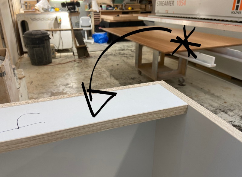
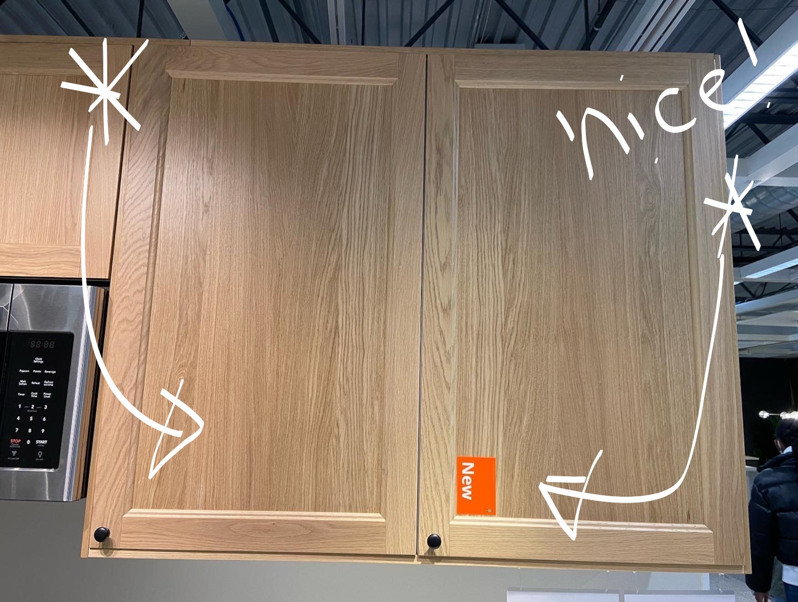
What does a 'million dollar mistake look like'? 
Like this ---> 

Can you spot it? Zoom-in for a better look,


I pushed and pulled on that image to make the discrepancy more obvious - an exaggeration. But essentially this is the outcome. I couldn't claim that this was art....

THE END

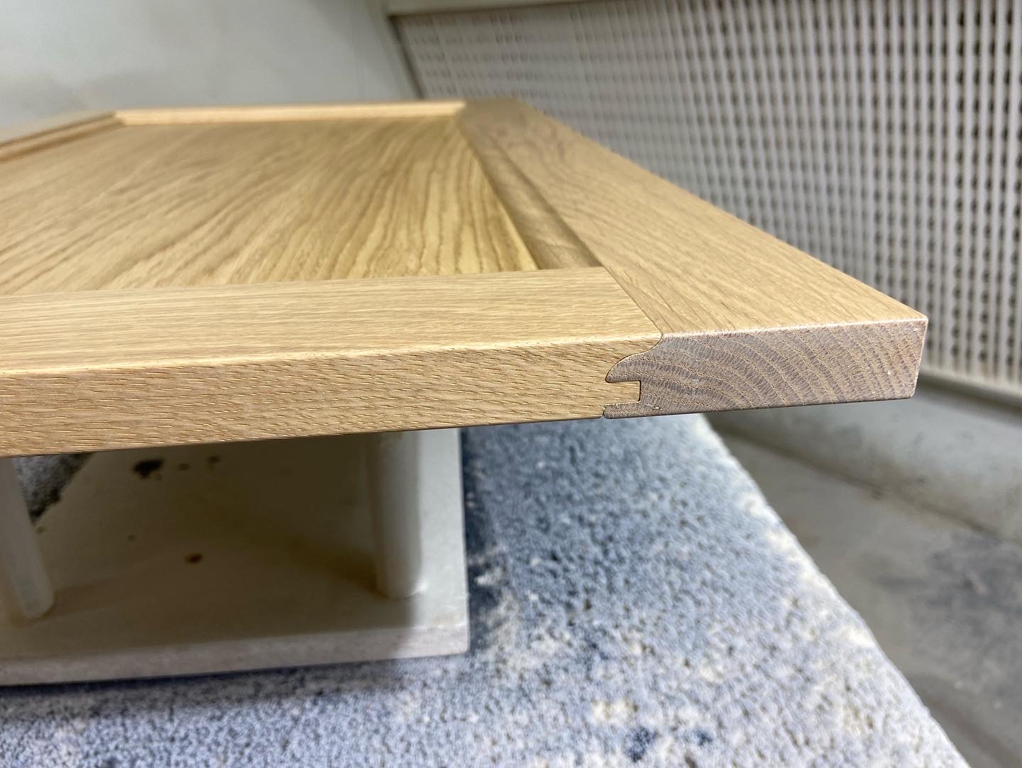
PS. Example of high-high end work, below. 


This is the nature of high end design - simplicity. I spent good hours rounding over by hand - 1/16" round over;  can't use any machinery; clients will run their hand on this detail ALL THE TIME


Sunday, March 27, 2022

Thoughts on the Housing Crisis + How to repair a VINYL plank;


[picture shows a freshly sprayed underside of a high-end solid wood cherry table sitting in a spray booth drying, juxtaposed with the spray gun used to execute this particular project, Kremlin Xcite]

Chapter 1 - The work for the 1% never stops. 

When I try to explain to people what I do - working for the 1%, building in the top 2% for quality - it's often hard. 'Yea, I build cabinetry,' I say. Or 'I do finishing like spraying or staining.' But it's stuff like this - top notch quality results delivered via superior tool that allows me to control absolutely ever element of delivery, paired with a neurology that thrives on 'high speed attention to details' - my SO called it 'Beat Saber for money.' 

This particular slab - American Cherry - a large amount of highly skilled labour hours [Steffan is a master solid wood builder! and what a purist! ha!] already went into it, and now it was up to me to make it shine, make it look best. 

This here is my own bossman's design, his own take on Parsons Table. Parsons Table is simply a fancy name for a table that if you were to extend the all the 'exterior lines' they would intersect, or touch, kinda. 

Like this --->


I ended up creating a Parsons Table as part of a school project - I am furniture designer by education. I found that exercise quite intriguing and challenging. My own version of Parsons Table in solid wood was a failure - my bossman's version tho is a successes. 

His design manages to accomplish several things, main of which is it absolutely showcases the actual building material; showcases the only appropriate material, because this design cannot be built out of anything other than solid wood. I always consider the 'amount of constraints on the design' as a sort of measure of 'purity of design' and ultimately the success of the design. 

It is so absolutely graceful - I find the edge detail very thoughtful and well resolved. That edge detail is also a nightmare to finish successfully - this design calls for a high degree of experience when it comes to finishing. I literally lost sleep over how I am going to spray this thing; and before I actually sprayed it I did a 'dry run' where I mimicked all the actions required to spray all surfaces correctly. But when you do... oh boy... it's stunning. 

Look ----> 


'OK,' you say, 'but this is precious material that not everybody can afford.' It's true - one critical measure of material is its affordability for general consumption; some materials are naturally restricted due to their sourcing costs and skilled labour required to work it. 

UPDATE: HERE it is!


But what about stuff like this --->


What are you looking at? 


Thursday, January 20, 2022

Ikea Hacker ADVICE - How to stack SEKTION boxes on a countertop?


[picture shows a beautifully designed kitchen based on the SEKTION box, featuring shallow SEKTION boxes stacked on the countertop for a layerd, nuanced, sophisticated look]


Chapter 1 - Stacking SEKTION boxes

Everyone knows that the SETKION box is incredible flexible, coming in with all sorts of sizes and super cool options that you would have to pay a meellion dollars for anywhere else [just for comparison: an IKEA 'Lazy Suzzanne' is ~200 bucks vs. $750 dollars for an equivalent option from other hardware manufacturers!].

But I have never been able to find clear directions and answers to properly stacking the shallow SEKTION box on a countertop - example above. Today, again, on Reddit, r/IKEA, someone posts this question:


They have created a design [likely set on the IKEA plastic legs, meaning this design will draw heavily on ALL the other 'look-alike Ikea kitchens' --> FIRST step in achieving a 'Custom Lewk' [tm] is taking your design OUT of the 'Ikea kitchen planner language'] and are wondering how to go about installing the shallow SEKTION boxes.

The shallow SEKTION boxes [because there are 2 depths to SEKTION boxes - DEEP and SHALLOW; both have their uses, benefits and advantages, as well as 'hackability level'] are set upon the countertop, above the deep SEKTION boxes to create a 'Hutch Look'. 

The 'Hutch Look' is essentially creating a 2 level design:
  •  Bottom one is deeper, roomier, with more storage. Typically with drawers; heavy stuff goes here; less pretty stuff goes here; ugly stuff that you want to hide goes here. 
  • Top is lighter, slender, shallower and typically the function is split between storage and display. This is where you would showcase you 'conspicuous consumption' in the form of fine and exotic china, precious collectibles and anything else that is meaningful to you - TRADITIONS are important. 
    ----> Designer Trick: to increase the perception of height in your space don't take your 'hutch design' all the way to the ceiling. If your space is SHORT - lacks height - leave a minor space between your cabinets and the ceiling as illustrated on my own hutch design. Oh, and skip the tall crown moulding opting instead for something simple, classic and well proportioned. This post talks about this particular design and gives you simple instructions on how to make your space look bigger - HERE is the write UP!

    ----> Designer Trick: To 'CROWN-mould' or 'not-to-CROWN-mould'..? My experience, my intuition, always tells me that hutches were 'work-furniture' first and thus I stay away from any 'too precious, too decorative, too pretentious' crown mouldings and ALWAYS choose the simplest, classic option that fits and matches the build. Remember, that the crown moulding is an integral part of much larger 'first impression' and should not 'steal the show'; simpler is better for hutches. 

Chapter 2 - 'Eloquent and historic' 

Below is an example of a very fine North American production hutch, ~1950's - just the bottom; will update overall shot - made in cherry. Yes, this is natural cherry when it ages as it should - on display. It is absolutely wild to me to think that my family bought this piece used, when we immigrated to Canada in 1991 for an equivalent of about '1.5 rents on a 3 bedroom unit'. Today I would not undertake this production for less than $30k - it is so beautifully and thoughtfully made; well detailed in elements that suggest great fluency in craft; the grain matches so well and clearly sourced from a single log; the quality of the wood is amazing in itself; the finish is holding up amazing; hardware if decorative and well made; load bearing! - holy cow!; it's just a really good quality piece. 


We won't be getting into the design aspect of hutches - balance, proportions, functionality, ----> this post focuses how to construct the look using SEKTION boxes.  I will give you 'my hutch' example. Here, it's an IKEA Hack too! - I highlighted all the elements that were sourced from IKEA - that's right, this is Swedish Socialism!


Here is the the list, all sourced from IKEA Etobicoke - the bestest of all location - 

  • 'A' is a pane of glass from a broken BILLY bookcase door that I picked up at AS-IS section for 10 bucks - good quality, nice thickness, excellent clarity, tempered for safety  [meaning the glass will break up into 1000's little harmless pieces instead of producing jagged shards; ALL glass in any millwork projects MUST be safety glass, so either tempered OR laminated; A MUST!!]
  • 'B' is a KARLBY birch slab that I picked up for $20 bucks because it was damaged in transit. Discount reflects the severity of damage to the piece - it was 'almost un-sale'able' - however for this particular design I was able to cut around it and salvage a really nice chunk of it. 


    ----> One of the most 'annoying things' with cabinetry and millwork in general is when the edging fails - the finish material that is applied to cover the exposed and vulnerable edges. The cheaper the build, the less thoughtful the design, the crappier quality the edging - it's the first to fail as is most exposed to typical 'bumps and bruises of kitchen life'. To avoid frustration and give it a solid, trouble free performance I applied a 1/4" thick Canadian hard maple edge. Right away I will confess that this decision was right - it's extra labour + materials... but  - it has saved this piece many times over! With 4 babies at home they all keep hitting and banging into that edge with various hard objects! The finish on the wood is BULLET-proof. For all my 'wood+water' situations I use a product called OSMO - it is a modern synthetic hardwax that cures hard for 30 days with my especially developed finishing process! - bulletproof; I even do exotic wood sculpted tub edges in this finish - damp and wet ALL the time!

  • 'C' are ENERYDAS, here ---->
This Ikea Hack Hutch design got an update recently - SO has been bugging me to fill up that empty space above the coffee maker. After pricing some nice looking hardware that came up to like 400 bucks [!!!], I opted instead to go with IKEA again, saving myself around 250 bucks.  Here!


Let's bring this picture here again. I think that this is such a beautiful and balanced kitchen design. The SEKTION boxes fit perfectly. But the most important observation that I want to make is this: it has certain 'eloquence and historicism'.


Do you want to know what the appeal of the 'Hutch look' is...? Simple - it's charming. Kitchen boxes plainly put together just to 'fill the space' lack the proper response from the viewer or user - kitchens, in my opinion, should evoke emotions whether you are aware of it or not [that's Psychology of Design!]. Oftentimes it's just a gut feeling - 'we like it; it resonates with us; it reminds us of something pleasant...'. But what...?

In my writings and designs I often talk about Psychology of Design - one of my obsessive interests is 'human behaviour in residential settings' [I created a term for it, I call it NHA - 'Necessary Human Activity' and I always try to optimize it; boring!!]. Our interiors have dramatically evolved over the last say 500 years, but our 'kitchen human behaviours' essentially stayed the same. Historically, cabinetry existed first as furniture. When a move was made to make that furniture more permanent - built-ins, kitchens - 'the dimensions of that move stayed the same', meaning the physical structure was bulked up for heavier loads, but objects created still matched the 'limits of human body': we can only reach so far and high; it's only comfortable to perform certain tasks [Necessary Human Activity] in certain 'body positions and angles'. And let me tell you that the HUTCH is perfect for it! - it's an 'organic, natural resolution' to our human needs. 

Now take a look at 'functional design history' and you will see countless examples of hutches ranging from the most utilitarian, basic work-kitchen hutches to exquisite, precious builds found in manors, made for 'displaying history and family's good taste.' You see hutches everywhere, every household has one, because they work, and they work well. The HUTCH is the workhorse of any family assembly! We all have seen them; we all have experienced them throughout our lives and likely have 'unconscious friendly hutch bias'. TRUE! 

All we are trying to do is to replicate, re-experience, re-live all those 'good times'! I think. Look, my own design, the one you see above, the IKEA Hack, I 'psychologically traced' [function, balance, proportions, display etc.] to a kitchen hutch that my Polish grandmother had in her ancient rental kitchen in New York city, during her immigrant years. The house she lived in - 30 years! - was built in the early 20th century featured all solid wood kitchen which had 'normal then, but exquisite by today's standard' joinery. So the quality was there right from the start, I could tell that as a curious child.  Bring into that 'The Charm Factor' - wonderful smells of cooking and baking during Christmas, Thanksgiving and Easter [smell is POWERFUL emotional trigger!]; tiny spice drawers; tall glass doors displaying various glassware and china. 


Those two pieces I highlighted in my own hutch I inherited from my grandma Helena ---> that ceramic blue fish is an exquisite Japanese serving bowl for fish soup from 1890; that ceramic kettle is British made from late 1800's as well. I treasure these piece immensely because I have wonderful childhood memories associated with them... My hutch is my family's history in some way... you know.


~~And that my friends is the secret to designing successful 'Hutch Designs' - call onto all your childhood memories... That's all!~~


Chapter 3 - Ok then, how do I stack the SEKTION boxes to make them look like a 'Hutch Design'...?

I am gonna say that IKEA will be an asshole** and for warranty purposes will claim that they need to be hung up - a classic SHALLOW SEKTION install - it's the best; the flexibility of that hanging system is incredible and needs a creative individual to truly open up the potential of it. 

Bummer is that for this to be done well, it needs to be done very very accurately. How accurately..? This accurately, LOOK ---->


I don't know what exact thickness of that piece of cardboard is, however, intuitively to me it feels like the right size gap that will allow for SETTLING of your millwork under load. Not judging, but people will ALWAYS overload their millwork - ALWAYS. I understand, that's why it is important to prioritize when you are organizing and decluttering and unload anything that you don't need. That's right, FREE yourself of your earthly possession that are weighing you down - that's one of the themes for 2022.

Exciting NEWS ---> I stumbled upon a professional who is MY equivalent but when it comes to organizing 'little stuff'! [I organize BIG stuff - kitchens, closets... etc. vs. LITTLE things, so everything else, like your clothes, electronics, etc. and things you don't even knew about. But let her take care of that. Her mind just works differently than other people! I follow her advice [after 10 years, I achieved Inbox ZERO, for example]. Her name is Melissa, and she is a fellow volunteer Scouter with Scouts Canada. When I met her she was responsible for managing [volunteer!!] the youngest category of kids in the organization - you know how adults talk that managing young children is taxing? try being efficient at it!

Anyhow, BACK to SHALLOW SEKTION installs - I use that paper for a particular reason - it's another IKEA hack, lol - it's the top flap of the SEKTION hardware box and it's found in every SEKTION box. If I was to guess how thick it is, I would say about 1.2mm...? I know what 2mm gaps on cabinetry look like [sharpest look!] and this is skinnier, but I also know that it's more than 1mm... But exactly...? who cares, why measure..? Using spacers such as these on site is an improvement in accuracy that is easily available! The other secret about that little cardboard tab is that is ~very dense~ - meaning it will not crush or collapse and keep that gap consistent as a spacer. Advantage you!


TO BE CONTINUED...


**oh, it's ok... Don't cry for IKEA... don't shed those single tears.  I feel at ease calling them assholes - WHY? - the next calendar year after my show and launch of my WILLIAM bookcase line, IKEA renamed their BILLY bookcases, you guessed... WILLIAM. 


~~'When you hack an IKEA BILLY bookcase and you elevate it in the process, it becomes a WILLIAM bookcase' - Karol Kosnik, 
Studio Kosnik.~~


See, Designing, as creative process is very wholesome and embracing. A good designers applies the entirety of their 'skills repertoire' to the project and considers everything, including 'naming strategies' and marketing. 

YEA, I was livid, but fuck it, one day we will resolve it, I promise you, and will let you know how it went. In the meantime I encourage you to experience what Intellectual Property Theft is FIRSTHAND and use your official IKEA app to search out my WILLIAM bookcase. Anyhow, I feel confident in my intellectual property ownership and clearly staked out my claim publicly, right here on this blog - IKEA take note.  If IKEA truly is as 'DEMOCRATIC DESIGN' as they claim, then they should acknowledge my contribution. Another issue is that for trademarks to be valid and upheld they must be used - that's the test - and so far it's just you and me looking up how IKEA is stealing from me. That's all. Firm I stand.


~~ 'I design for the unreasonable.' - Karol Kosnik,
Studio Kosnik ~~


ps. Here is another TRICK!