[prelude]
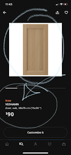
[picture shows a screenshot of VEDHAMN door listing on the Canadian IKEA app]
VEDHAMN is IKEA's new door for their SEKTION boxes - a solid white oak frame with a veneered plywood panel trapped in the centre. It is a plain frame featuring a small round as the solid transitions from the frame to the inside panel. It is sprayed with a clear acrylic finish - a lot clearer than the 'traditional cellulose look' of white oak. The selection of the solid appears good with minimal grain run out; the centre panel veneers feature nice long open grain.
This is what you want in your door, really - if it is the AI robotic arm and eye that selects the veneers and assembles the doors it is doing a great job. Look -
Chapter 1 - I love White Oak
White oak is one of the nicest hardwoods that we have growing here in North America. It is used to the climate, it always grew here and thus is well suited for any purpose that requires hardness, durability and good looks.
White oak is also one of the hottest designer woods right now, and due to the inflation and demand it is commanding astronomical prices with decreased selection. It is not uncommon to purchase entire lifts of quartered white oak solid not just to secure a good price but also to secure the quality that you want - every board is looked over and its placement carefully considered within the larger scope.
Historically this has not been the case at all. White oak was always looked down as the secondary cousin to red oak. If you did not have money for nice red oak hardwood floors, you could always compromise and get white oak instead. Savigs were around $1 a sq.f in material costs back in my flooring days; and if the flooring was stained than it was even harder to tell and the savings were good.
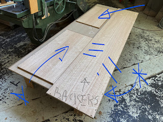
Today red oak has fallen so much out of favour that beautiful red oak veneers - one of the nicests sequenital flitch layups I have seen in my life! - are used as backers on 'more precious layups'. Look -
[picture shows beautiful and precious 'tiger stripe' figure red oak veneers used for backers on more in demand white oak veneers;]
Eventually even IKEA could not resist to jump on the white oak bandwagon - remember, it's always about the sales; 'people's wants, needs and desires' I wrote once, to describe IKEA's business model. Yes, design is cyclical and tastes need to be made [media / magazines] but white oak could not be pulled off successfully with thermofoil, I think, because white oak is quite culturally too familiar to us, and by 'us' I mean the Western Sphere of influence. White oak doors had to be solid.
Enamoured? I've always been, and have some white oak doors currently in my personal life. They are aging gracefully and feature the 'traditional cellulose look' - never underestimate the power of visual association! They are yellowing nicely but because of the purposeful, 'white oak centered design', that shift is completely out of focus and not a visual priority. What is a visual priority is the wood itself - the hand selected out of a lumber pile; emotional attachment the it was carried thru design woodworking school waiting patiently for its inteded purpose not known until the ver last moment; and FINALLY it rests as a beautiful, handcrafted, highly detailed solid wood door with the centre panel being glass from a damaged BILLY bookcase door.
Hahahaha! Yes! My very own 'super precious 2 me' white oak door has a 'cheap IKEA glass in it' - it's an IKEA Hack. I really like the clarity of glass doors for BILLY bookcases - it's almost like Starphire glass; clarity is really amazing. But the best part about it is the safety - it smashes to small, harmless smitherines. Where I come from to have a piece of glass like that is expensive - the AS-IS section from IKEA is fertile gorund for all sorts of amazing glass; seize on the opportunities!
But if you want to go Large White Oak then you have to hire a knowledgable designer, that is the only way I would advise to do white oak large scale. Essentially it needs to be handled by professionals, otherwise the yellow will soon become overwhelming and not in a good way.
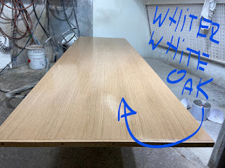
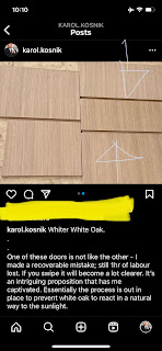
[picture shows a custom laid up side panel in 'whiter white oak'; 'whiter white oak' is a unique finishing process that prevents white oak from aging in 'yellow']
So how do you balance your desire to bring a beautiful wood into your space with its natural aging characteristics? By the way any natural wood will exhibit a colour change over its lifespan.
Chapter 2 - How 2 handle 'The Yellowing' of white oak
Firstly, embrace it - that's how it was meant to be so don't obsess too much about it.
Second - use as accent doors to bring the sophistication of white oak into your own space.
I would choose to install them as uppers, or if you are Design Hacking, 'at eye level' - however you understand that term; sometimes it is important to trust your own instincts, your own gut feeling vs. 'what others are doing'.
I would focus on creating a balanced grouping of doors, likely no more than 5-6, that will focus attention on a specific area where you feel 'your kitchen will be strong' - eyes will naturally run for that visual element. White oak is a wood that looks great with virtually any solid colour so VEDHAMN doors can be surrounded with any slab doors, including IKEA's VEDDINGE doors. And, if you do choose VEDDINGE as a complement to VEDHAMN, than you can gain additional savings by going with IKEA's skinny stock panels.
Chapter 3 - Is there anything else about VEDHAMN?
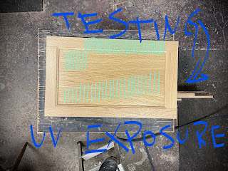
I am currently running some experiments on the VEDHAMN finish. Look -
[picture shows a VEDHAMN door with a series of narrow masking tape strips stuck on the solid of the frame, as well as the centre panel]
UPDATE [end of April 2023]
I wish I could spend more time writing about this issue, but alas I've got to work, lol. Not recommending these doors for any white oak designs - there are colour issues with the doors as they age; less than 2 years on the market and the problem is appearing more and more;
The frame and and the inset panel are going in the opposite direction - this has started to happen at IKEA Etobicoke. I have been watching that door, snapping pics and comparing it to my test panel.
The frame is 'going white' and the inset panel is 'going yellow' - the pieces used to assemble the doors were not colour matched properly. The IKEA catalogue is double-confusing because is illustrates a flawless wall of VEDHAMN doors, with the frame and the panel blended visually. YES, it would have been perfect if that was the case in real life.
You can't prevent the sun or light from reaching the doors. You assume the worst case scenario and work from there. So where is the plan?
I don't know who is responsible for quality control at IKEA, but they messed up. On my last job I was literally losing sleep [it turns out I did make few recoverable mistakes; no profits realized in fixing mistakes*] to ensure that the entire wall of doors, drawer faces, panels, columns, shrouds, filler pieces all looked the same.
What does a 'million dollar mistake look like'?
Like this --->
I pushed and pulled on that image to make the discrepancy more obvious - an exaggeration. But essentially this is the outcome. I couldn't claim that this was art....
THE END
PS. Example of high-high end work, below.
This is the nature of high end design - simplicity. I spent good hours rounding over by hand - 1/16" round over; can't use any machinery; clients will run their hand on this detail ALL THE TIME




.jpg)